 smart-home
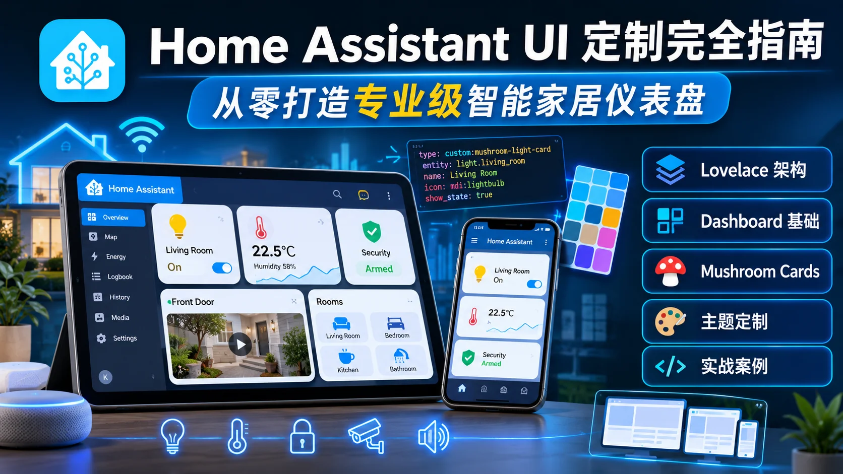
Home Assistant UI 定制完全指南:从零打造专业级智能家居仪表盘
当你第一次打开 Home Assistant,看到的可能是这样的界面:一堆密密麻麻的设备列表,毫无美感的默认卡片,功能齐全但视觉上像 2010 年的后台管理系统。
别急着关掉——这正是 Home Assistant 最强大的地方。它的 Lovelace UI 框架允许你从每一个像素开始重新设计,把默认的”工程师界面”改造成媲美商业智能家居系统的专业仪表盘。
本文将带你从零开始,系统掌握 Home Assistant UI 定制的全部技能:从 Dashboard 基础架构到 Mushroom Cards 组件库,从 YAML 主题文件到动态切换,从条件显示到 SVG 集成——最后用 3 个完整的实战案例,让你直接复制粘贴就能用。
Home Assistant UI 系统概述
什么是 Lovelace?
Home Assistant 的 UI 系统叫做 Lovelace,它是一个基于 YAML 配置的声明式界面框架。与传统的”拖拽式”仪表盘不同,Lovelace 的核心理念是:
- 声明式配置:用 YAML 描述界面结构,而非手动拖拽
- 卡片(Card)驱动:每个功能单元都是一张卡片,可以自由组合
- 视图(View)分层:一个 Dashboard 可以包含多个视图(标签页)
- 主题(Theme)控制:全局颜色、字体、间距通过主题文件统一管理
Dashboard 的文件结构
Lovelace 的配置存储在 configuration.yaml 中(或通过 UI 编辑存储在 .storage/lovelace 中)。一个典型的 Dashboard 结构如下:
# configuration.yaml
lovelace:
  mode: yaml  # 使用 YAML 模式(推荐)
  resources:
    - url: /hacsfiles/mushroom/mushroom.js
      type: module
    - url: /hacsfiles/button-card/button-card.js
      type: module
  dashboards:
    main-dashboard:
      title: 我的家
      icon: mdi:home
      cards:
        - type: vertical-stack
          cards:
            - type: mushroom-title-card
              title: 欢迎回家
            - type: mushroom-chips-card
              chips:
                - type: entity
                  entity: sensor.temperature
Dashboard 基础:视图类型与布局
三种视图类型
Home Assistant 提供三种主要的视图布局方式:
1. Masonry(瀑布流,默认)
卡片按顺序排列,自动填充空白区域。适合卡片大小不一的场景。
views:
  - title: 客厅
    panel: false
    cards:
      - type: light
        entity: light.living_room
      - type: sensor
        entity: sensor.temperature
2. Panel(单列)
所有卡片垂直排列,每张卡片占满整行。适合大屏展示。
views:
  - title: 总览
    panel: true
    cards:
      - type: custom:button-card
        # ...
3. Grid(网格)
使用 CSS Grid 布局,可以精确控制每张卡片的位置和大小。
views:
  - title: 厨房
    type: grid
    cards:
      - type: light
        entity: light.kitchen
        style:
          grid-column: span 2
核心卡片组件
Mushroom Cards:最流行的 UI 组件库
Mushroom Cards 是 Home Assistant 社区最受欢迎的自定义卡片库,它提供了简洁、现代的 Material Design 风格组件。
安装方式:
通过 HACS(Home Assistant Community Store)安装:
- 打开 HACS → 前端 → 搜索 “Mushroom”
- 点击安装
- 重启 Home Assistant
- 在
configuration.yaml中添加资源引用
常用卡片类型:
# 标题卡片
- type: custom:mushroom-title-card
  title: 客厅控制
  subtitle: 3 个设备在线

# 实体卡片(最常用)
- type: custom:mushroom-entity-card
  entity: light.living_room
  name: 客厅灯
  icon: mdi:lightbulb
  tap_action:
    action: toggle

# 芯片卡片(紧凑信息展示)
- type: custom:mushroom-chips-card
  chips:
    - type: entity
      entity: sensor.temperature
      icon_color: orange
    - type: entity
      entity: binary_sensor.door
      icon_color: green

# 模板卡片(高度自定义)
- type: custom:mushroom-template-card
  primary: 当前温度
  secondary: "{{ states('sensor.temperature') }}°C"
  icon: mdi:thermometer
  icon_color: "{{ 'red' if states('sensor.temperature') | float > 30 else 'blue' }}"
Button Card:终极自定义按钮
Button Card 提供了比 Mushroom 更细粒度的控制,适合需要复杂交互和条件样式的场景。
- type: custom:button-card
  entity: light.living_room
  name: 客厅灯
  icon: mdi:lightbulb
  show_state: true
  styles:
    card:
      - border-radius: 15px
      - padding: 15px
      - background-color: >
          [[[ return states['light.living_room'].state === 'on'
                ? 'rgba(255, 200, 0, 0.2)'
                : 'rgba(100, 100, 100, 0.1)' ]]]
    icon:
      - color: >
          [[[ return states['light.living_room'].state === 'on'
                ? 'gold'
                : 'gray' ]]]
    name:
      - font-size: 16px
      - font-weight: bold
  tap_action:
    action: toggle
  hold_action:
    action: more-info
Card Mod:全局样式修改器
Card Mod 允许你通过 CSS 修改任何卡片的外观,是实现深度定制的关键工具。
- type: custom:mushroom-entity-card
  entity: light.living_room
  card_mod:
    style: |
      ha-card {
        border-radius: 20px;
        background: linear-gradient(135deg, #667eea 0%, #764ba2 100%);
        box-shadow: 0 10px 30px rgba(0, 0, 0, 0.3);
      }
      ha-card:active {
        transform: scale(0.98);
      }
主题定制:YAML 主题文件
创建自定义主题
在 config/themes/ 目录下创建 YAML 文件(如 my_theme.yaml):
# themes/my_theme.yaml
my_dark_theme:
  # 基础颜色
  primary-color: "#6366f1"
  text-primary-color: "#ffffff"
  secondary-text-color: "#a1a1aa"

  # 背景
  background-color: "#18181b"
  card-background-color: "#27272a"

  # 状态颜色
  state-icon-color: "#a1a1aa"
  state-icon-active-color: "#6366f1"

  # 字体
  primary-font-family: "'Inter', sans-serif"

  # 圆角
  ha-card-border-radius: "16px"

  # 阴影
  ha-card-box-shadow: "0 4px 6px -1px rgba(0, 0, 0, 0.3)"
动态主题切换
使用 input_select 和自动化实现主题动态切换:
# configuration.yaml
input_select:
  theme_selector:
    name: 主题选择
    options:
      - default
      - my_dark_theme
      - my_light_theme
    initial: my_dark_theme

automation:
  - alias: "切换主题"
    trigger:
      - platform: state
        entity_id: input_select.theme_selector
    action:
      - service: frontend.set_theme
        data:
          name: "{{ states('input_select.theme_selector') }}"
高级 UI 技巧
条件显示
根据设备状态动态显示卡片:
- type: conditional
  conditions:
    - entity: binary_sensor.motion
      state: "on"
  card:
    type: custom:mushroom-entity-card
    entity: light.living_room
    name: 检测到运动
动画效果
使用 Card Mod 添加 CSS 动画:
- type: custom:button-card
  entity: climate.living_room
  card_mod:
    style: |
      ha-card {
        animation: pulse 2s infinite;
      }
      @keyframes pulse {
        0%, 100% { box-shadow: 0 0 0 0 rgba(99, 102, 241, 0.4); }
        50% { box-shadow: 0 0 0 20px rgba(99, 102, 241, 0); }
      }
SVG 图标集成
使用自定义 SVG 图标替代默认的 Material Design Icons:
- type: custom:button-card
  entity: sensor.solar_power
  icon: "data:image/svg+xml,%3Csvg xmlns='http://www.w3.org/2000/svg' viewBox='0 0 24 24'%3E%3Cpath fill='%23fbbf24' d='M12 2L2 7l10 5 10-5-10-5zM2 17l10 5 10-5M2 12l10 5 10-5'/%3E%3C/svg%3E"
实战案例:3 种风格仪表盘
案例 1:简约现代风
适合日常使用的简洁界面,强调信息层次和留白。
title: 我的家
views:
  - title: 总览
    path: overview
    type: masonry
    cards:
      # 欢迎标题
      - type: custom:mushroom-title-card
        title: "{{ '早上好' if now().hour < 12 else '晚上好' }}"
        subtitle: "{{ states('sensor.weather_description') }}"

      # 快速状态芯片
      - type: custom:mushroom-chips-card
        chips:
          - type: entity
            entity: sensor.indoor_temperature
            icon_color: orange
          - type: entity
            entity: sensor.indoor_humidity
            icon_color: blue
          - type: entity
            entity: binary_sensor.front_door
            icon_color: green

      # 客厅控制
      - type: vertical-stack
        cards:
          - type: custom:mushroom-title-card
            title: 客厅
          - type: custom:mushroom-entity-card
            entity: light.living_room
            name: 主灯
            icon: mdi:lightbulb
          - type: custom:mushroom-entity-card
            entity: media_player.tv
            name: 电视
            icon: mdi:television
          - type: custom:mushroom-climate-card
            entity: climate.living_room
            name: 空调
            hvac_modes:
              - 'off'
              - heat
              - cool
案例 2:科技感仪表盘
深色主题 + 渐变背景 + 动画效果,适合壁挂大屏展示。
title: 控制中心
views:
  - title: 控制中心
    panel: true
    cards:
      - type: custom:layout-card
        layout_type: custom:grid-layout
        layout:
          grid-template-columns: 1fr 1fr 1fr
          grid-template-rows: auto
        cards:
          # 时间日期
          - type: custom:button-card
            show_name: false
            show_icon: false
            show_state: true
            entity: sensor.time
            styles:
              card:
                - background: linear-gradient(135deg, #667eea 0%, #764ba2 100%)
                - border-radius: 20px
                - padding: 30px
              state:
                - font-size: 48px
                - font-weight: bold
                - color: white

          # 天气
          - type: custom:button-card
            entity: sensor.weather_temperature
            show_name: false
            icon: mdi:weather-sunny
            styles:
              card:
                - background: rgba(255, 255, 255, 0.1)
                - border-radius: 20px
                - backdrop-filter: blur(10px)
              icon:
                - color: "#fbbf24"
                - size: 60px

          # 安防状态
          - type: custom:button-card
            entity: alarm_control_panel.home
            show_state: true
            styles:
              card:
                - background: >
                    [[[ return states['alarm_control_panel.home'].state === 'disarmed'
                          ? 'rgba(34, 197, 94, 0.2)'
                          : 'rgba(239, 68, 68, 0.2)' ]]]
                - border-radius: 20px
              icon:
                - color: >
                    [[[ return states['alarm_control_panel.home'].state === 'disarmed'
                          ? '#22c55e'
                          : '#ef4444' ]]]
案例 3:移动端优化布局
针对手机屏幕优化的紧凑布局,使用单列垂直排列。
title: 移动端
views:
  - title: 快速控制
    path: mobile
    panel: true
    cards:
      - type: vertical-stack
        cards:
          # 顶部状态栏
          - type: horizontal-stack
            cards:
              - type: custom:mushroom-chips-card
                chips:
                  - type: entity
                    entity: sensor.indoor_temperature
                    icon_color: orange
              - type: custom:mushroom-chips-card
                chips:
                  - type: entity
                    entity: sensor.indoor_humidity
                    icon_color: blue

          # 场景按钮
          - type: horizontal-stack
            cards:
              - type: custom:button-card
                name: 回家
                icon: mdi:home
                tap_action:
                  action: call-service
                  service: script.activate_home_scene
                styles:
                  card:
                    - background: "#6366f1"
                    - border-radius: 12px
              - type: custom:button-card
                name: 离家
                icon: mdi:exit-run
                tap_action:
                  action: call-service
                  service: script.activate_away_scene
                styles:
                  card:
                    - background: "#ef4444"
                    - border-radius: 12px
              - type: custom:button-card
                name: 睡眠
                icon: mdi:bed
                tap_action:
                  action: call-service
                  service: script.activate_sleep_scene
                styles:
                  card:
                    - background: "#8b5cf6"
                    - border-radius: 12px

          # 常用设备
          - type: custom:mushroom-entity-card
            entity: light.living_room
            name: 客厅灯
          - type: custom:mushroom-entity-card
            entity: light.bedroom
            name: 卧室灯
          - type: custom:mushroom-entity-card
            entity: switch.kitchen
            name: 厨房
硬件推荐:控制面板设备
一个好的智能家居仪表盘需要合适的硬件载体。以下是几种常见的控制面板方案:
平板电脑方案
iPad / Android 平板
- 优点:屏幕大、触控流畅、可壁挂
- 缺点:需要供电、可能过热
- 推荐:旧 iPad 改造,配合 Fully Kiosk Browser 全屏显示
专用触控屏
- Home Assistant Green:官方推荐硬件,预装系统
- Raspberry Pi 7” Touch Display:7 英寸官方触摸屏,适合 DIY 壁挂方案
嵌入式方案
对于想要更深度集成的用户,可以考虑用 ESP32 + 触摸屏模块制作专用的控制面板。ESP32 支持 LVGL 图形库,可以运行自定义 UI,通过 MQTT 或 REST API 与 Home Assistant 通信。这种方案成本更低(约 $15-30),但需要一定的嵌入式开发经验。
如果你正在使用 ESP32-C6 或 ESP32 Matter 智能灯方案,可以直接将这些设备接入 Home Assistant,并在仪表盘中统一控制。
社区资源推荐
- Home Assistant 官方文档:Dashboard 配置权威指南
- HACS(Home Assistant Community Store):社区插件和主题市场
- Home Assistant 论坛:全球最大的 HA 用户社区
- r/homeassistant:Reddit 社区,大量用户分享截图和配置
- Mushroom Cards GitHub:组件源码和 Issue 追踪
总结
Home Assistant 的 UI 定制能力是它区别于商业智能家居系统的核心优势。通过 Lovelace 框架、Mushroom Cards、Button Card 和 Card Mod 的组合,你可以打造出完全符合自己审美和使用习惯的智能家居仪表盘。
关键要点回顾:
- 从 YAML 模式开始:虽然 UI 编辑器方便,但 YAML 模式提供更精细的控制
- 善用 Mushroom Cards:简洁、现代、易于配置,适合 80% 的场景
- 主题文件统一管理:不要在每个卡片里硬编码颜色,用主题文件集中管理
- 条件显示减少干扰:根据状态动态显示卡片,避免信息过载
- 硬件选择很重要:一个好的触摸屏能让日常使用体验提升一个档次
如果你已经搭建了 MQTT 自托管 Broker 或用 ESP32 搭建了 IoT 传感器网络,现在正是把这些设备整合到 Home Assistant 仪表盘中的最佳时机。
此外,你可以参考我们的 ESP32 低功耗门窗传感器实战指南,了解如何制作超低功耗的智能家居传感器节点,完美集成到你的 Home Assistant 系统中。
开始定制你的智能家居控制中心吧——你的家值得一个更聪明的界面。